A Definitive Ranking of Mascots in the Chagrin Valley Conference
No, Beachwood isn’t ranked first…
EDGEWOOD WARRIORS
This article is meant for entertainment purposes, but in all seriousness, when will we as a nation get tired of characterizing Native American individuals as our sports team mascots? It’s not honorific, it’s dehumanizing. Edgewood is dead last on account of the perpetuation of an exhausted stereotype.
BROOKLYN HURRICANES
With that aside, let’s move into ranking these mascots based on design and name, the way Mother Nature intended. And Mother Nature was not kind down in Brooklyn, OH. The Brooklyn Hurricanes logo leaves much to be desired. It reminds me of the rotating gear on the Settings icon. The quality of graphic design is also laughable, almost reminiscent of 2008 Microsoft Paint. That isn’t really a compliment.
TRINITY TROJANS
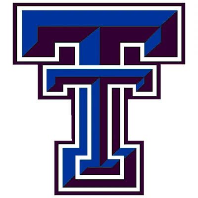
I am just so puzzled by the Trinity Trojans. I scoured the annals of Google Images to find a character mascot, but all I found was this turducken situation with capital Ts. Is it cool to look at? Sure. Does it look like it evokes any semblance of school pride or loyalty to a sports team? I’d be hard pressed to say it does.
BEACHWOOD BISON
Don’t get me wrong, I am forever a proud Beachwoodian. I bleed white and gold, and if you were to rip my heart out of my chest Indiana Jones-style, BISON STRONG would be tattooed on the beating, bleeding viscera. But our mascot’s kind of mediocre. For a school that is rife with individuality and creative expression, a silhouette of a mascot is giving us the short end of the stick.
LUTHERAN WEST LONGHORNS
The minimalist trend is not something I stand against. Clean, defined edges and an elementary color palette are all fine by me. But I do believe that school logos that feature their mascot should be maximalist on principle. It should be giving Baroque, not broke. The name ‘Lutheran West Longhorns’ has a whopping six syllables, which is about six too many if you compare it to their barebones mascot. The color contrast is interesting, but not enough to convince this profligate mind otherwise.
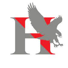
HARVEY RED RAIDERS
![]()
Harvey, you are raising more questions than I even asked, which was just one: What is the focus here, the horse or the rider? Or is it the barely-perceptible lance? On that note, why do you have so many elements in a single mascot? Why is it a ‘Red’ Raider? If it’s purely arbitrary, why not go all out and have a Chartreuse Raider? If it’s for the sake of alliteration, then how about a Rose Pink Raider? Answer me, Thomas W. Harvey High School.
RICHMOND HEIGHTS SPARTANS
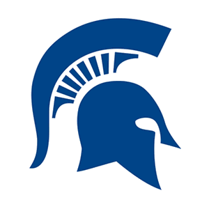
See, this isn’t bad. There is some approximation of a face here, which is a start. It’s coherent, although still minimalist, which we all know how I feel about. In reality, I only have one qualm with Richmond Heights, and that is its striking similarity to Case Western Reserve University’s Spartans. Even as I am writing ‘Richmond Heights’, when my eyes flick upwards to see the Spartan head, my brain screams, “CASE!”. Maybe that’s a me thing, but then again, this whole ranking is a me thing.
HAWKEN HAWKS
We’re finally getting into ‘outward appearance of facial features realm’! You have to strain to see it, but look at that eye and that beak! No more ambiguous delineations of animals, armor, or letters of the alphabet! If you can’t tell, I’m extremely excited. That being said, though, Hawken Hawks is just silly. Can you imagine the principal yelling into the intercom, “Good morning, Hawken Hawks!”. It sounds like if someone had a bad case of whooping cough while simultaneously regurgitating a marshmallow. Not a fan.
WICKLIFFE BLUE DEVILS
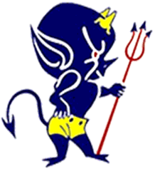
Something just doesn’t sit right with me when I look at this little guy. He looks like he’s up to no good. Look at that arched eyebrow and cheek bulge! He is devising a mischievous scheme for your downfall with one arm akimbo, but instead of being threatening, it’s just unsettling. The length of those shorts is also so interesting. He would definitely get dress coded.
CARDINAL HUSKIES
![]()
#FreeTheHuskies is now my mantra. The Cardinal Huskies are objectively cool. It has a purposeful gaze and an angular bone structure that makes me want to start a gua sha routine. The problem here is that the husky is bound by this crest and the banner screaming CARDINAL HUSKIES in your face. A good mascot shouldn’t even need to have the school name attached to it. It should immediately be indicative of the team that it represents. The Cardinal Huskies have this potential, but are shackled, bound and caged by the unsightly lettering.
CUYAHOGA HEIGHTS RED WOLVES
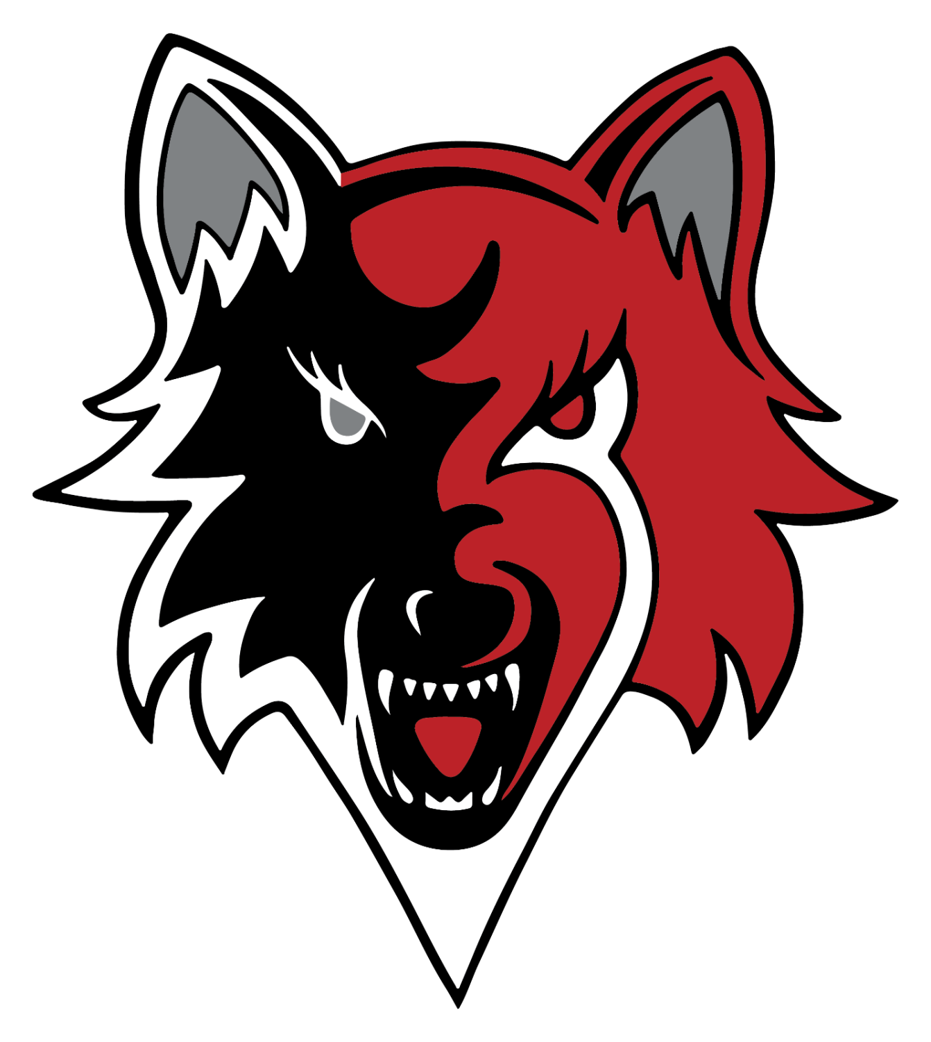
The reason why Cuyahoga Heights wasn’t placed much higher is kind of silly, but bear with me. Or should I say ‘wolf’ with me? Anyways, the main problem here is the weird shading for the wolf’s facial hair. His ‘beard’, if you will, is defined rather sharply and is completely white. So, if you look at it a certain way, the beard looks like an ice cream cone, and the wolf’s head is a big scoop of ice cream. That ruins it for me. I am unable to take this otherwise very menacing mascot seriously.
GENEVA EAGLES
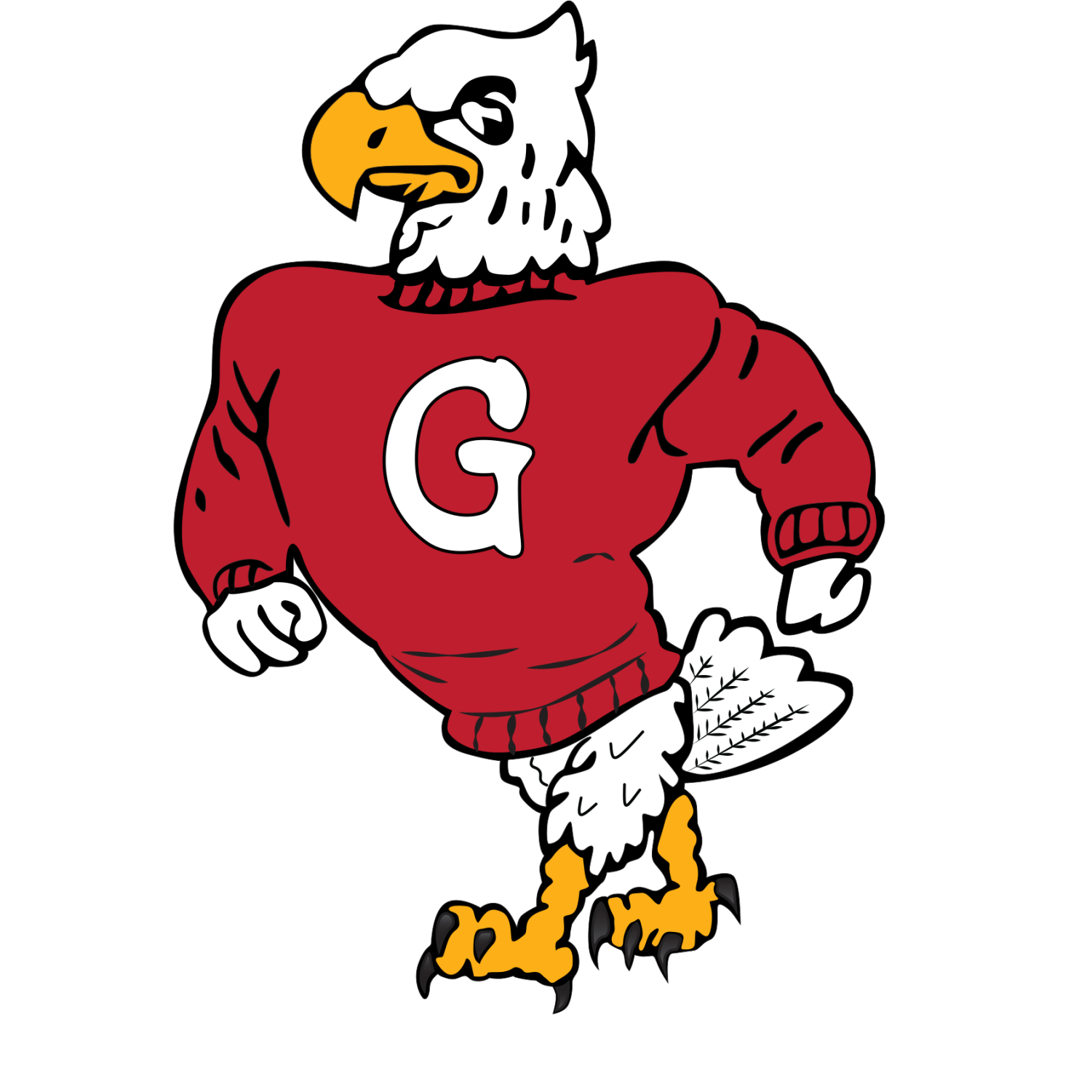
I looked at this for a long time. I knew something was off, but I couldn’t place exactly what it was. Then it hit me. It’s his stupid sweater. How can you look threatening when you’re wearing a crew neck sweater á la Ariana Grande? But that frown and gait more than make up for it, placing it square in the middle of this ranking.
LAKESIDE DRAGONS
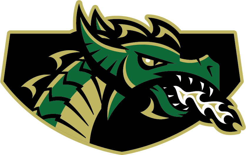
There is so much wasted potential here, it’s almost starting to remind me of myself. When you have a dragon as a mascot, how can you not include its wings OR its tail? How? Why did Lakeside have to go and decapitate this dragon? I can’t write any more commentary, it’s making me too upset.
WEST GEAUGA WOLVERINES
Besides the fact that I have an existential crisis whenever I try to spell Gee Gae Geag Geauga, this mascot is pretty cool. A wolverine is a creative choice, and the expression is spot on. I just can’t get over how warped it looks. His face looks distorted into this circular shape, like it was supposed to fit in a profile picture icon. The curvature ruins an otherwise perfectly good mascot.
BERKSHIRE BADGERS
![]()
You know, I actually didn’t realize that the Berkshire Badger is also wearing a sweater, like the Geneva Eagle. But how can you blame me! This man walks with pomp and circumstance! He’s not letting the sweater wear him, he is WEARING that sweater. The snarl also really does it for me.
ORANGE LIONS
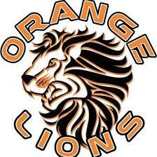
I, very graciously, decided not to judge Orange’s mascot by that block letter O. You’re welcome. I know we’re rival schools, but this article is free from bias. At least, in some aspects. Same problem with Cardinal, though, in that I can’t find a picture of this lion without lettering covering it in some part. But the fact that the lion is so much more detailed than the Cardinal Husky places it way ahead. Just take a gander at that magnificent mane.
INDEPENDENCE BLUE DEVILS
![]()
Now that is the face of absolute disdain. I admire just how convoluted the facial expression is. I don’t know that I even have that many muscles in my own face. The jaundiced complexion is throwing me in for a loop, but I guess flesh-colored skin would be even more disconcerting.
PERRY PIRATES
The first phrase that came to mind when I looked at the Perry Pirate was ‘Johnny Depp-esque’. I guess that tells you all you need to know. 10/10 mascot.
CHAGRIN FALLS TIGERS
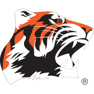
Chagrin Falls did not hold back with this tiger! It is absolutely terrifying, and I love it! This has more life and energy than some college mascots, and college sports are much more important than high school sports, so that’s a big deal. I find myself just staring at it between typing sentences. Truly a great mascot.
CRESTWOOD RED DEVILS

Yes, I know that this has letters, and I’ve said time and time again that I don’t like letters. But slow down there, I said that I don’t like letters obscuring the image. In this picture, the two are entirely separate, giving me space and time to enjoy the fella up there. And he’s fantastic! In fact, I wanted to rank it in first place, but…
KIRTLAND HORNETS

Kirtland definitely beats everyone out of the park. And I could mean that literally too. Look at that musculature! This hornet is so dynamic, I can almost see motion in how he rolls his sleeves up. If I were playing Kirtland, and I entered the gym to see the Kirtland Hornet blown up on the wall in front of me, I can guarantee that I would let them win. They deserve it.

Samah Khan (she/her) started writing in the fall of her sophomore year in 2020. She enjoys covering macroscopic world issues and their impacts on the Beachwood...


.jpg)